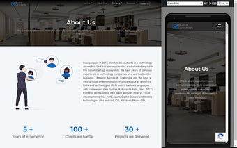
Be Responsive: Build Smooth and Responsive Websites
Be Responsive is a Chrome extension developed by bluetick-consultants. This free tool falls under the category of Browsers, specifically Add-ons & Tools.
Be Responsive is designed to help developers build smooth and responsive websites. It allows you to render your website in both desktop and mobile view simultaneously, making it easier to test the responsiveness of your web pages across devices.
With Be Responsive, you no longer need to navigate to separate pages or manually resize your browser window to check how your website looks and functions on different screen sizes. This extension simplifies the process, saving you time and effort.
By using Be Responsive, developers can ensure that their websites are effective and provide a seamless user experience across various devices. Whether you're working on a desktop or mobile project, this tool can greatly enhance your development process.